Rebranding Successfully: 4 Killer Strategies
March 11, 2019
Kelton's partner, Killer Infographics, shares 4 strategies to make your next rebrand successful.


This article was originally written and published by our partner, Killer Infographics, a world-class visual communication agency.
The idea of rebranding your organization may seem daunting. Where should you even begin? What parts of the brand should you revamp and why? How different should the new aesthetic feel? You don’t need to have all the answers right away — but you should never rush a rebrand.
No matter your path, you’re probably motivated to rebrand because your existing brand is feeling stale, outdated, or no longer relevant to your organization. To get you started, here are a few guidelines for visual aspects of your organization that you may consider switching up in a rebrand.

CONSIDER YOUR COMPANY LOGO
Your logo is the most condensed embodiment of your brand. It communicates who you are, what you do, and how well you do it. An outdated or ill-conceived logo could stop potential customers in their tracks. In fact, just the shape of your logo can create subconscious impressions of your brand.
Your logo’s color can do the same, although you should always design a version of your logo in black and white to ensure its impact in all potential scenarios.
Since so much is riding on your choice of logo, here are a few guidelines to follow:
- Make it simple
- Keep your values and industry top of mind
- Consider what the logo will look like with and without your company name included
- Make sure you have both horizontal and vertical versions
- Define clear design guidelines for how and where your logo can be used
REBRAND YOUR FONTS
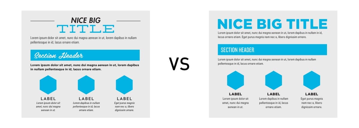
Your brand’s main font communicates a lot about your organization’s personality. Fonts can be elegant, whimsical, or all-business — but they should always be eye-catching.
It’s also critical to consider how your logo will work in partnership with your fonts. Make these decisions in the same phase of your rebrand — as a part of building your visual language — so that you can be sure of creating the right overall aesthetic.
Remember, your fonts should be:
- Clearly legible
- Complementary to your logo
- Indicative of your brand’s personality and mission
ASSESS YOUR COLOR PALETTE
In the “Company Logo” section above, we linked to a study which found that the color of a brand’s logo directly impacted an audience’s perception of the brand. According to that University of Missouri study, here’s what each color of logo communicated:
- Blue: Confidence, success, reliability
- Green: Environmentalism, toughness, durability, masculinity, sustainability
- Purple: Femininity, glamor, charm
- Pink: Youth, imagination, fashion
- Yellow: Fun, modernity
- Red: Expertise, self-assurance
While this study exclusively evaluated the colors’ impact as it relates to logos, your brand color palette may encompass additional colors that don’t appear in your logo. Consider all your colors as a family, and make sure they work in harmony with the logo and fonts that tell your story the best.
CREATE PHOTO, ICON, AND ILLUSTRATION GUIDELINES
All aspects of your brand should be clearly communicated throughout your organization. This includes the aesthetic of, and scenarios in which, photos, icons, and illustrations are used. Without clear communication on this, someone making an asset for you could use an image that’s highly off-brand, creating visual confusion among your collateral. Examples of guidelines include:
- Whether photos are on-brand, and what their content should be (abstract, single-object, no people, only people, etc.)
- Clearly defined icon and illustration styles
- When to use icons vs. more involved illustrations

Even if brand is what your organization specializes in, don’t go about rebranding alone. Get insight from trusted colleagues to uncover potential — even unintentional — conflicts or missteps in your new choices. This could avoid major headaches when launch time arrives!
Finally, remember not only to consider these aspects in your rebrand, but to document them in a brand book. This lets you cement your decisions in a reliable format and share those decisions among your team and with any vendors who need to reference or adhere to the brand.
Got a rebrand of your own on the horizon? Killer and Kelton would love to help — learn more here.
About Killer Infographics
Killer Infographics is an industry-leading visual communication agency that executes visual content strategies across a diverse array of media, including infographics, motion graphics, augmented reality, interactive experiences, and more. Its custom-designed campaigns help clients speak visually to the audiences that matter most. An Inc. 5000 company for three years running, Killer has won more than 30 awards for excellence in visual communication. It has designed and executed successful visual strategies for a myriad of Fortune 1000 companies, including Amazon, Boeing, the Discovery Channel, Edwards Lifesciences Corporation, and Microsoft.